navigation
This article is a stub. You can help the IndieWeb wiki by expanding it.
Navigation refers to the UI, UX and markup allowing people to move around a website. On indieweb sites this often consists of:
- top-level post type links e.g. notes, articles
- previous/next pagination between consecutive chronologically ordered posts
- the use of tags to navigate to similar content
Why
So users can easily discover more of your content from your content, preferably contextually relevant, e.g. in time (next/previous), by topic (tags), by type of posts (e.g. just notes, just articles, just events, just likes).
How
As with any UX there are a number of approaches. Best to check the IndieWeb Examples provided in each level.
Simple linear/sequential previous/next navigation across posts by time order
Options to consider:
- all posts
- "root" posts only (everything but responses)
- sequential nav only among posts of a specific type (notes, photos, articles, etc.)
IndieWeb Sequential Examples
Tantek
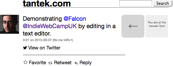
 Tantek Çelik uses Falcon on tantek.com to display a previous/next navigation using unicode symbols (←→) on all post permalink pages since 2010-01-01 (explicitly documented 2010-02-01). Original navigation UI:

Navigation arrow variants for first, other, last items:

Silo Sequential Examples
After years of lacking simple sequential navigation, sometimes in 2016 Twitter added sequential navigation to *some* permalink views, and then dropped it sometime later, apparently in 2018.
E.g. this used to work: (should've taken screenshots at the time in 2016)
- https://twitter.com/t/status/747412761081044992 shows white left and right "angle bracket"-like arrows
- displayed to the left/right of the tweet respectively
- navigates to the next/previous tweet respectively (violating left-prev right-next timeline convention)
- clicking the "right" arrow goes to the *previous* tweet https://twitter.com/t/status/747412585666904064
- but skips @-replies
- clicking the "left" arrow skips a couple of @-replies and goes to https://twitter.com/t/status/747465866598506496
time period based archive pages and navigation across them
See also:
tagged posts paginated
tag based archive pages (paginated by time or amount) of your own content
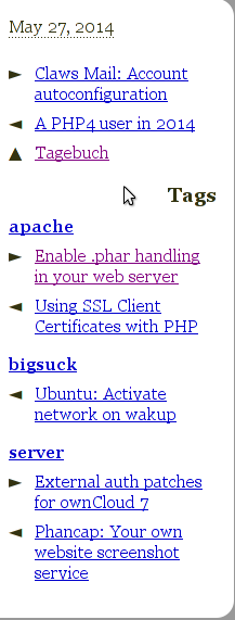
- User:cweiske.de uses tag-based and chronological prev/next links

Design
Temporal Direction
In the past there have been debates about the correct "meaning" of left / right sequential navigation arrows in the UI on posts or archive pages etc.
There is general agreement that:
- Left = back, right = forward
This is unanimously consistent in Browser UIs for example. The back button always points to the left, and always shows you the previous page / URL you were viewing, whereas the forward button renavigates your forward along the path you previously took.
However when it comes to temporal references to permalinks and archives there are two positions:
- Left = past (older), right = future (newer)
- Left = future (newer), right = past (older)
In detail:
Left Past
Examples:
 Tantek Çelik
- ...
Articles:
- 2011-04-12
 Tantek Çelik: Navigation arrows: always back to the past and forward to the future. Back to the Future is a movie, not a UI pattern.
 - 2018-04-13 The Guardian: If you move a meeting forward, what does that really mean?
move a meeting with me “forward” a few days […] With my dying breath, I’ll maintain that this means moving it into the future, forward along the timeline I picture projecting into the distance from where I’m standing
Left Future
Examples:
 Kartik Prabhu (only on archive pages, no sequential nav on permalinks)
- ...
Articles:
- 2015-07-11
 Kartik Prabhu The Web’s Arrow of Time - in which Kartik presents presents examples of both Left Past and Left Future and ends up concluding that due to predominant reverse-chronological-timelines, that on the web Left Future makes more sense for him!
Brainstorming
IndieMark Levels
Levels of navigation support have emerged from implementations in the wild and are part of IndieMark.
In approximate order of frequency and difficulty (more frequent / easier to implement first):
- 1. no requirements
- 2. sequential navigation
- 3. time period based archive pages
- 4. tag based archive pages (paginated by time or amount)
Future levels Possible futures: (brainstorms, don't know of anyone doing these)
- geo (e.g. city/state/country specific) based archive pages
- mentions of a person (person tags)
