2017/perweb
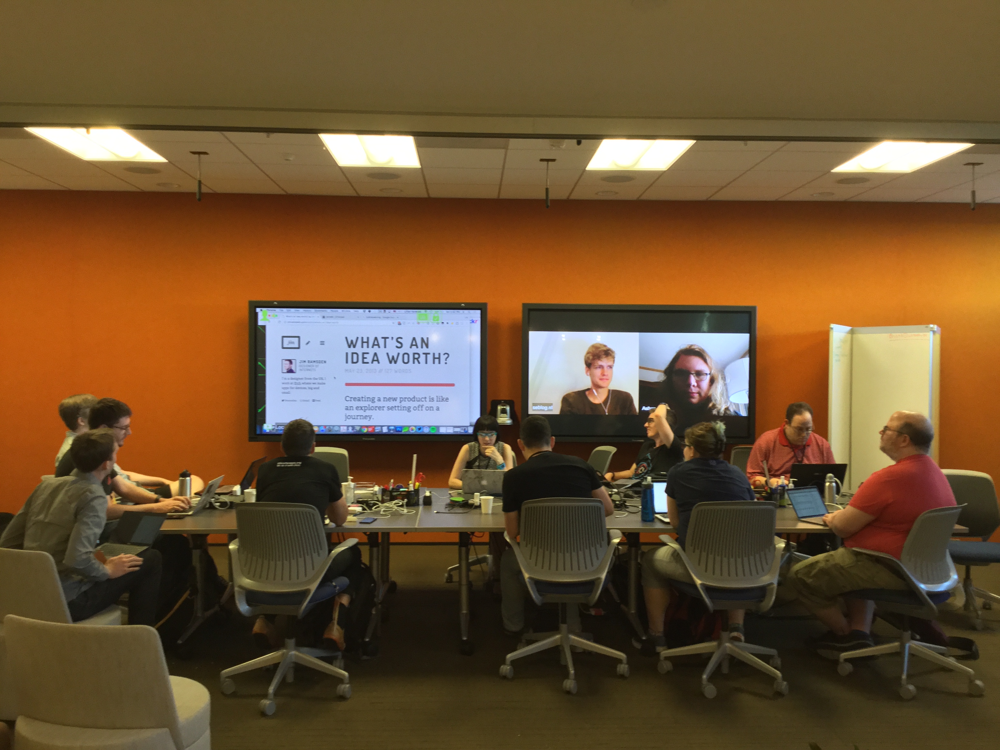
Personal Website Layouts was a session at IndieWeb Summit 2017.
Notes archived from: https://etherpad.indieweb.org/perweb
Video at: https://www.youtube.com/watch?v=AnleiM6ea_M
When: 2017-06-24 16:00
Participants
 Grant Richmond
 Jonathan LaCour
- Michelle JL
 dougbeal
 Martijn van der Ven (remote)
- John Allsopp
 gRegor Morrill
 Marty McGuire
 Sebastiaan Andeweg (remote)
 Chris Aldrich (remote)
Notes
It is a struggle to find functional pretty personal website designs. Particulary for indieweb websites
Suggested Sites
- http://eliseblaha.typepad.com
- photography heavy
- looks like CMS but isn't
- archives are entirely by category
- http://brennannovak.com (down - looked at it via archive.org)
- essay pages - black text on white background. good line-height/whitespace. good contrast on links.
- http://cleverdevil.io
- homepage only shows long-form writing and photo posts
- big background image, just for flavor
- maps are the default from withknown - clean grayscale leaflet maps
- http://aaronparecki.com/2017/06/
- calendar view w/ lots of icons. lots of moon icons that made people think of "coexist"
- http://seblog.nl/2017/06/
- calendar view w/ icons. also shows reacji.
- http://grant.codes
- splash page text anomation
- lots of movement!
- grant.codes/timeline - map on the background moves as you scroll back through the timeline! (http://owntracks.org for data, leaflet map updates as page scrolls to location embedded in post at the top of the view)
- http://andy-j-miller.com
- cute text w/ hand-drawn appearance and subtle animation
- full of super colorful images (he is an illustrator)
- http://www.adhamdannaway.com/
- interesting split face header
- http://v4.jasonsantamaria.com
- uniq designs for each post.
- archive includes things like the main color for the post's design (e.g. "yellow")
- also includes thumbnail screenshots of the articles
- looks very like print design
- http://trentwalton.com
- articles look a lot like medium.com
- http://kartikprabhu.com
- lots of custom indentation and other whitespace manipulation
- http://www.nytimes.com/projects/2012/snow-fall/
- super custom scrolling overrides, incl video backgrounds fading in and out
- https://www.bloomberg.com/businessweek/design-conference/
- bloomberg was like "we get design. and we hate it. and you." (very tongue-in-cheek)
- archive page (I'm biase but like it :) https://gregorlove.com/archives/
- archives by month, each day looks like a calendar box, but to 5 per row.
- http://hansbrinker.com/
- very print-like block printing design
- anomalily: side-to-side scrolling elements can be interesting on "my day" sites
- https://theoutline.com/
- http://ncase.me/fireflies/
- gRegor http://designbyproxy.com
- http://shauninman.com
- links try to follow the cursor as you mouse over/out, then snap back.
- also has an 8-bit archive http://shauninman.com/pact/
- Screenshot of another landing page: https://www.flickr.com/photos/unmatchedstyle/4553686703
- Shaun’s blog used to slowly change background colour over time. Screenshots:
- http://keithjgrant.com
- beautiful subtle animations in the menus
- super neat text title effects (background shows through, some kind of blend mode)
- CSS text effects (semantic HTML + CSS - and some SVG - works in most browsers) https://codepen.io/collection/DamKJW/
- http://jimramsden.com
- that landing animation, wooww.
aggregator: http://www.verynicesites.com/ <== basically this session in a nutshell
Jonathan: A lot of websites look very similar.
Animation (specifically use of gifs)?
- used to be a big part of the web
Let's end with zombo.com (or http://html5zombo.com/ )
Fun terrible UI design: http://www.creativebloq.com/inspiration/bad-volume-sliders-are-a-masterclass-in-terrible-ui-design
Which of these two websites are you designing: https://twitter.com/jongold/status/694591217523363840?lang=en
Good looking Podcast Pages
- http://responsivewebdesign.com/podcast/
- http://insertuser.nl
- the player is crazy! bouncing text and floating links. moves the page around as you listen.
- http://geekouts.xyz
- live scrolling and highlighting transcript as audio plays. also allows jumping playback by clicking on the text.
TODOs:
- https://hotlinewebring.club/ - looks like it's run by jkphl? we should ask him to make an indiewebring.club??

