autosuggest
This article is a stub. You can help the IndieWeb wiki by expanding it.
autosuggest (AKA auto-suggest) is a user-interface feature that provides a list of options while the user is typing, related to what the user has typed, possibly beyond mere (sub)string matches.
Background
At IndieWebCamp 2012 a bunch of participants noted that there are several building blocks we need in order to advance the indieweb beyond just being a collection of hyperlinked independent websites. One of those is the notion of Indie autosuggest, in particular, for typing/picking a person, e.g. using their name or alias (@-name or otherwise).
Patterns
There are plenty of documented design patterns around the web for single line, static-content inputs (e.g. tag inputs, email To/CC/BCC), but hardly anything for multi-line, dynamic-content UIs where autosuggest is context-sensitive.
IndieWeb Examples
- none currently
Silo Examples
Examples from silos on their websites:
Facebook on facebook.com in their search bar at the top has excellent autosuggestion of names of people you are connected to, pages you've "liked", and even people you *may* know (i.e. 2nd degree).
Twitter on Twitter.com in their Compose Tweet Box:
- Brings up suggestion UI on first character after @, no #tag autosuggest support
- Autosuggestion UI is a dropdown menu below the textarea
- Return accepts autosuggestion and appends a space, spacebar does nothing
- Backspace exits autosuggestion UI
- @name autosuggestion shows @name, full name and profile photo
Google+
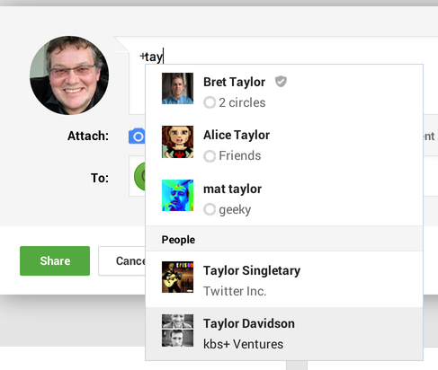
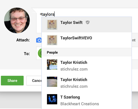
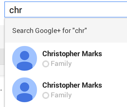
GooglePlus on plus.google.com in the "share what's new…" box (if prefixed by @ or +), or bare in the to: or top search boxes will autosuggest,
- first from your circled people,
- secondarily from other people with public profiles.
- finally from pages.
- It shows full name, photo and circle(s).
- It does not show any unique ID (email or URL), leading to poor UX if someone has multiple gmail accounts.
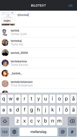
Instagram in its app has autosuggest in its image description box for both users and hashtags:
Platform Examples
Examples specific to a particular platform.
iOS Tweet Sheet
The iOS built in Tweet Sheet UI:
- Brings up suggestion UI on first character after @, no autosuggest for #tags
- Requires tap on UI to accept autosuggestion
- Backspace does not exit autosuggestion UI
- @name autosuggestion UI shows @name, full name, profile photo
- Photos: iPad iPhone
Twitter iOS app
The iOS Native Official Twitter App:
- Brings up autosuggest UI on @ or # character entry
- Requires tap on UI to accept autosuggestion
- Backspace exits autosuggestion UI
- @name autosuggestion shows @name, full name and profile photo
- Photos: iPad
Analysis
Lack of consistency
In conclusion, there is almost no consistency between UIs across platforms or even between platforms.
Common aspects
Common denominators (add more as they emerge):
- @name autosuggestion shows @name, full name and profile photo
Related sessions
sessions both discussed indie autosuggest a lot, and resulted in some code demonstrated as part of the day 2:
- Open Follow hack (code on github).
Prototypes
Demonstrations
- http://www.youtube.com/watch?v=TvXtyA5J05k
- A demo of a fairly capable post-in-place UI with tag and @-name autocomplete

