Shrewdness
This article is a stub. You can help the IndieWeb wiki by expanding it.
Shrewdness is a micropub-enabled reader web app, currently being developed by Barnaby Walters.
After experimenting with a flow-based-programming environment which doubled as a reader, an indieweb personal search engine and an anti-spam tool, I realised that all three things required the exact same plumbing, and that it made the most sense to build them all as one tool. That tool is Shrewdness, named after the collective noun for an aggregation of apes, as its job is going to be aggregating apes.
- code
- prototype
- Feed testing UI
- documenting pain points, enabling technologies
- mockup of multi-feed subscription UI
Brainstorming
Much of the brainstorming around the wiki on various reader-related topics applies:
Further brainstorming on those topics should take place there, and only Shrewdness-specific brainstorming follows.
Focus-enhancing
Existing reader interfaces are minutely optimised for retention, to give users many small dopamine rewards for looking at them regularly — that is, rewarding distraction. Reader UIs should at least be aware of this danger, and ideally actively fight it.
Potential ways Shrewdness could enhance focus:
- Once posts in a timeline/feed view have been “seen”, they could either be hidden or de-emphasised, perhaps by reducing opacity, contrast, blocking out photos and faces, blurring out the whole post, reducing font sizes. This would mean that, on looking at your reader, you only see things which are actually new, removing the temptation to scroll down the timeline.
- Provide entry points for doing particular tasks (e.g. a search, writing a post, actively reading a longform article) which bypass potentially distracting timeline views used for passive consumption
Column-based
Shrewdness has a column-based UI inspired largely by SFW, Trello and TweetDeck. I have a bunch of ideas for taking this idea further, making it the basis for creating flexible, customisable environments for reading and writing.
- multiple spaces within which columns can be organised
- within each space, columns scroll horizontally (or swipe between on narrow screens), content within columns scrolls vertically
- various types of columns, e.g. (bold = currently implemented)
- posts: subscribe to sites, list posts, filter/search within those, update in near-realtime, push notifications, in-context reply/like/repost etc.
- search: search posts across all subscribed sites, also search pages they linked to/other archives, people, images, etc.
- URL embed: embed the contents of a URL in an iframe
- post list: drag in individual posts, order arbitrarily/by date added/by original date
- calendar: list events in a continuous calendar format, filter, RSVP controls
- post compose: write text notes/articles
- plain text/HTML: write content into the
- moderation view: when acting as a webmention proxy, show undecided mentions (i.e. not in allow or blocklist), provide ability to accept/block
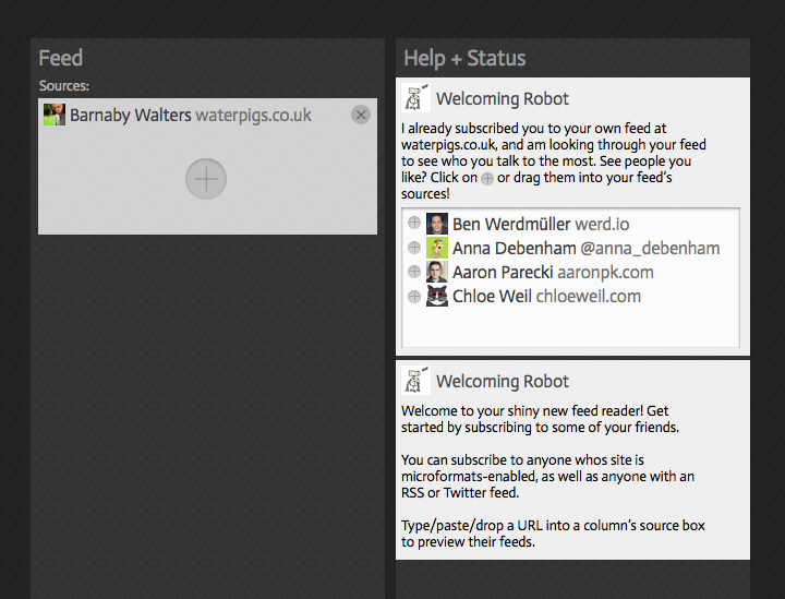
- welcome column: guides new users through the process of adding new columns and subscriptions, interactive help and automation (see design screenshots below)
- log column: plumbing information e.g. server errors, PuSH pings, webmentions displayed as events in a column
- todo list column: basically like a trello column, a list of tasks
Columns are orderable within spaces and movable between spaces by dragging. Often items within columns are draggable between them e.g. subscriptions between post columns, posts into list columns, posts/images/people/events draggable into composition columns creating auto-citation markup or customisable embeds.
Use cases/example usage of these concepts:
- Passive consumption dashboard space with firehose feed, mentions feed, several topical search feeds
- Topic-related space with subscription column following prominent sites, search columns, post list columns for archiving/queueing of interesting posts for future reference or followup
- Per-article draft space with article composition (+preview) column, search columns, post list column of references, image search column for finding assets
- Reaction/interaction/moderation space with direct mentions, messages, search for references to self, spam moderation queue
UI Design/Mockups
Feed reader UI mockups, created in Sketch. Main view:

Designing the bootstrapping process, welcoming new users:

Feed Testing UI
The bulk of the plumbing code for shrewdness is the indexing code which takes HTML and dices it up into neat posts which can be indexed by elasticsearch and presented as a feed. In order to test that code a UI is required which, given a feed URL, shows exactly how that feed will be parsed, indexed and displayed.

This, along with some pedagogy, could form the basis of a feed validation tool in the future.
Previous Work
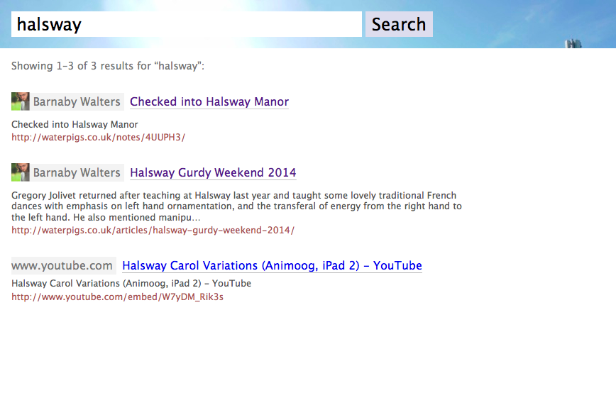
A screenshot of the personal indieweb search engine I made from my link archive:

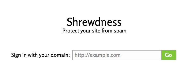
Some screenshots of the anti-spam tool which got merged in to Shrewdness:


